
Giving personal styling a more expressive identity.
Edition by Harriet, Personal Styling
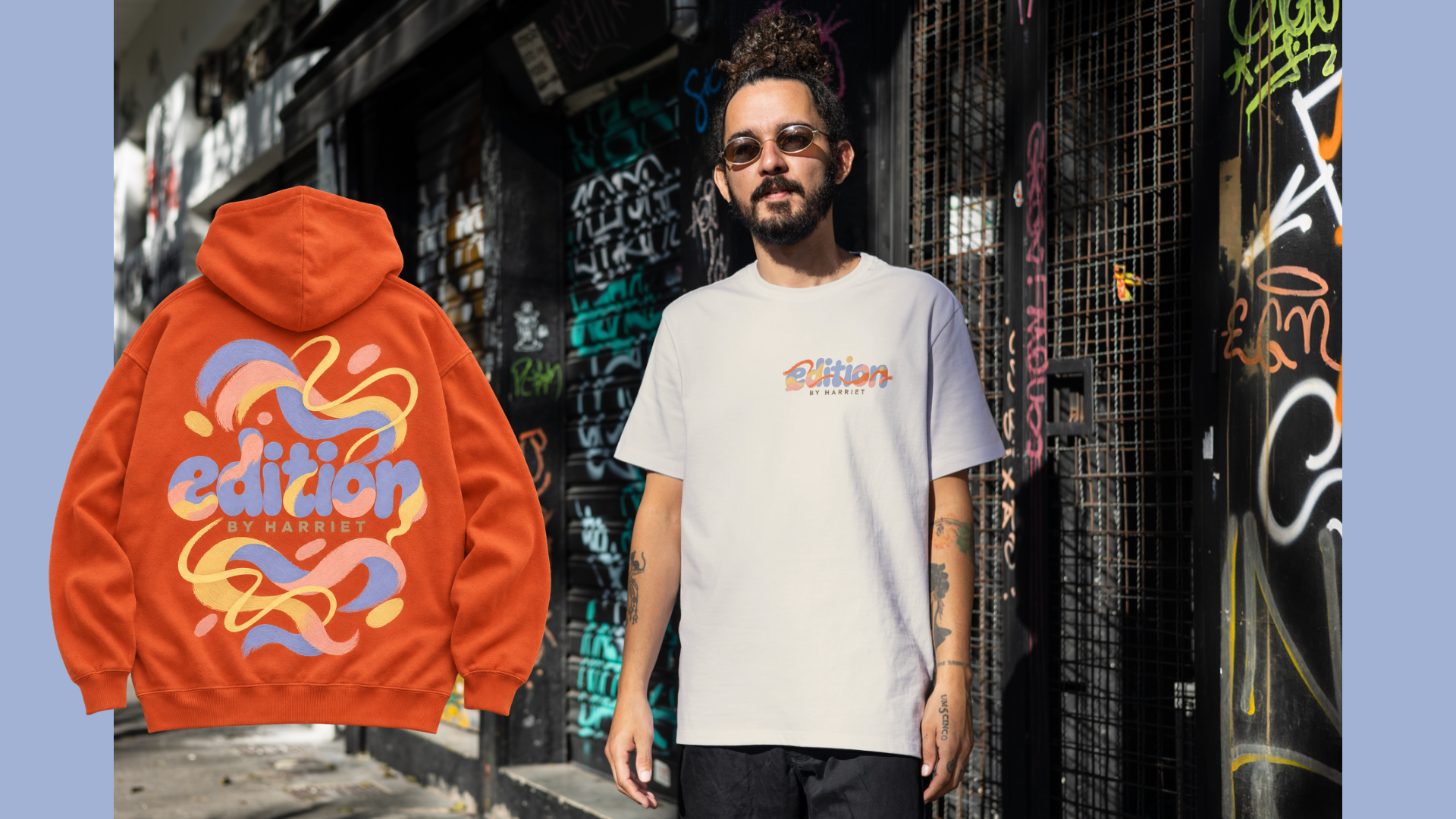
Harriet wanted a brand that felt as approachable as her styling practice, with the creative confidence to stand out. The brief was to build an identity that welcomed people in and encouraged them to see their wardrobes differently.
Personal styling is a close working relationship. Before someone books a session, the brand needs to give them a sense of the person they will be working with. For Edition by Harriet, that meant expressing Harriet’s eye for unexpected combinations while making the experience feel accessible.
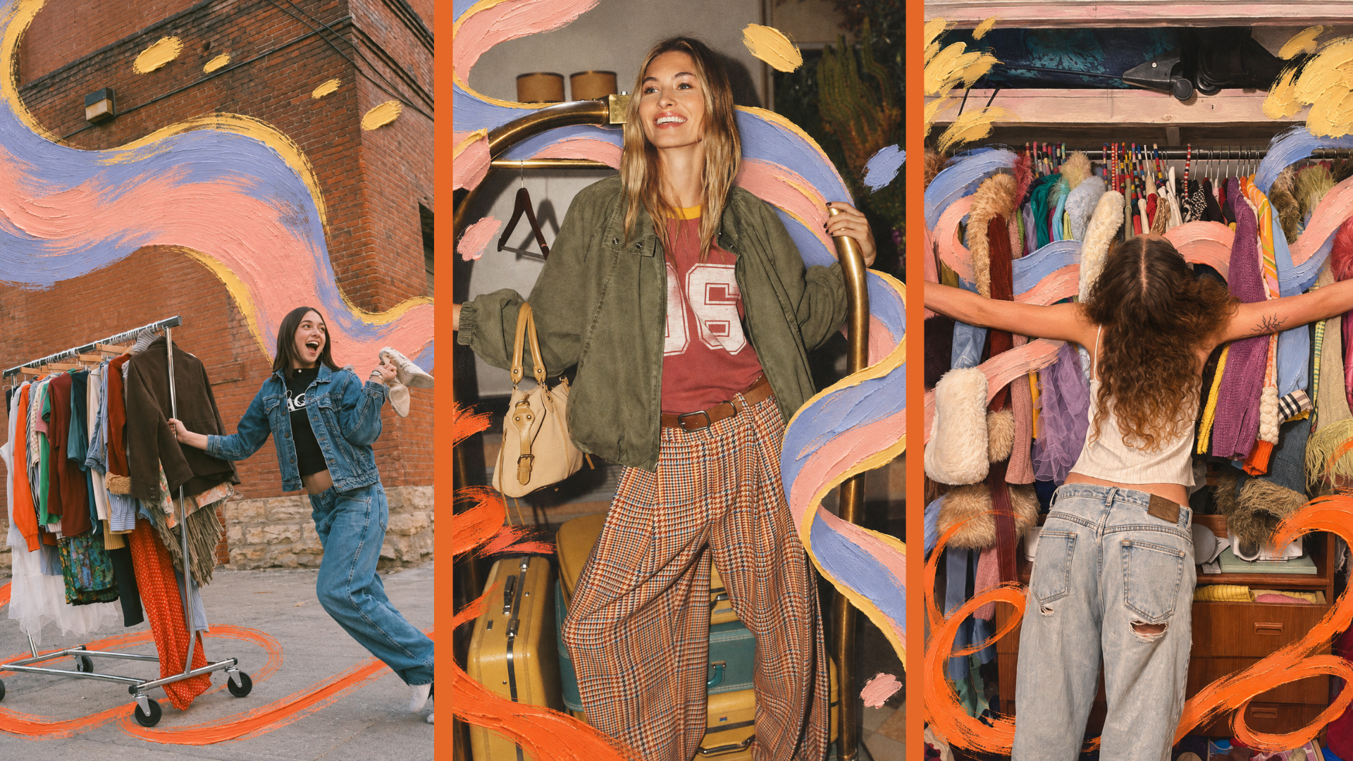
We explored different visual directions, looking at how rounded lettering could work alongside a more expressive graphic language. Harriet selected the artwork route: a direction built around painted interventions that bring a fresh perspective to familiar fashion imagery.
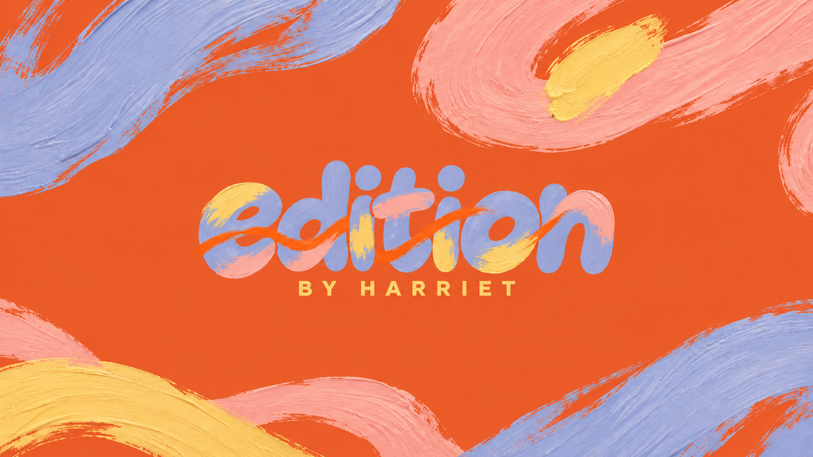
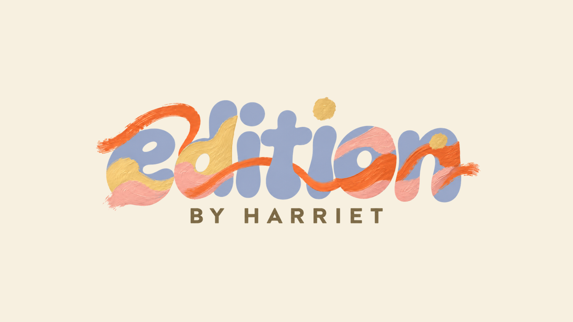
The logo pairs soft bubble lettering with paint that moves through the letterforms. A sharper “BY HARRIET” underneath gives the composition structure, balancing its loose, artistic character.
We developed this approach into a wider visual identity. Oversized brushstrokes weave behind figures in photographs and spill beyond the edges of layouts. Tomato orange gives the palette its energy, with periwinkle providing a softer contrast. The artwork can take over a whole surface or appear as a small, considered detail.
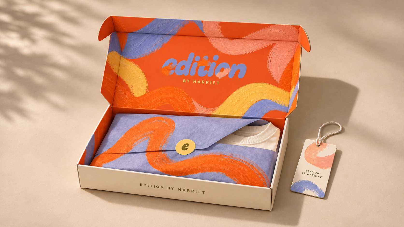
Packaging concepts explored how that contrast could become a physical experience. An understated box opens to reveal an orange interior covered in painted artwork, with periwinkle tissue carrying an oversized brush gesture. Website mockups applied the same thinking online, giving the imagery space while keeping navigation precise.
The result is an expressive identity that feels friendly without losing its edge. A logo and supporting asset pack give Harriet the foundations to carry the direction across her brand, with room for the artwork to evolve as her business grows.